Monday, 25 March 2013

Album Cover


This would be the side of the front cover:


Digipaks are a patented type of CD packaging which is made out card/paperboard. Usually, digipaks can open up like a book or they could have a more unique design, such as a three-part digipak in which one portion of the packaging opens to the right and other to the left. The part of the digipak which is made to hold the CD(s) is made of plastic, which is attached to the paper background. Digipaks are often used for special edition versions of CDs and are typically filled with designs and graphics


Codes and conventions of a digipak:


·         Album art
·         Track listing
·         Card/paperboard packaging
·         Lyric booklet
·         Credits
·         Copyright logo
·         Artistic cover
·         Pictures of band members
·         Quotes from reviewers
·         DVD(s) depending on the type of digipak.
·         Barcode
·         Web addresses
·         Folding packaging
·         Date of release
·         List of band members' roles
·         Square based packaging


Front:
The name of the artist, the name of the album and song list will all be in the same front style and colour.
Spines of the cover:
It usually has the artist and the name of the album. It always has the disk insides format like the CD logo and also would have a serial code, which would define it.

The album uses a cardboard styled casing, which opens like a regular CD case, but then opens again additionally on the right panel to expose the CD inside the digipak. There is also a little pocket (which also folds outwards) on the inside of the front cover on the left that holds the Digipak's booklet, and tour information. When the Digipak is folded out to it maximum potential and the CD removed from its casing, there is a band photo that stretches across the whole of the Digipak.


This is the front cover which uses an illusion effect of darkness when you can see clear light. This is done by the grey water at the bottom of the cover that goes off into a foggy type mist.  The 6 silhouette also add to creating a form of edgy darkness to the cover as they are black. This creates a contrast with the white background that takes up most of the cover. 
                                             

Opening the cover it exposes two panels one has a photo of two of the band members on the left and on the right shows a collage of the band when they were recording the album and the band logo in the middle. These panels keep the house style and it is kept consistent throughout the whole of the Digipak.

 
This is the collage on the right panel with the logo within the middle

CD case open fully

It has three compartments

The first compartment holds the booklet within its pocket. Its also has the image of 1 that makes up of 3. 
The second compartment holds the CD disk with the bands logo on the cover, which usually is the one that holds all the music from the album. This compartment has a plastic disk holder instead of the slit and also the strongest and heaviest part of the digipak. The back has the 2nd picture of to 3 that make up 1.
The third compartment has the 3rd picture that completes the image .

 
Cover flaps over the CD


CD is removed showing a large close up shot of the band


Inside the inside cover is a front pocket that has a of tour programme and CD booklet


The booklet is located inside the front panel in a small pocket, on the front hold the same image that is on the front of the CD case and hold information and lyrics to the songs on the album as additional pictures.


CD
It was a very creative way to incorporate  the bands logo onto the CD with the song list written within the logo at the edge. Whilst still keeping the theme of style.


Back of the cover:
The back cover of the digipak, again shows the band in the same location, with the rack list above them located in the sky, between the clouds. Has a barcode which most albums and any product would have.
Has parental explicit contents logo on it as like a age restriction thing has all the makers and publications at the bottom with billing in small print a back ground for all this information to go on and the main code and convention the names, the numbers of the songs and any special features.

Elements of a Digipak:


Sunday, 24 March 2013

Getting up to speed


We re shoot some old scene since on Monday 4th March 2013, we felt they need to be done again


Monday, 4 February 2013 … Shoot 3


What was being filming:
We had issues with filming the original hall scene, as we didn't not have enough extra or paper bag to fill up the crowds.  We then took advice from our Media teacher by using the English block.
Emmanuel was screaming and shouting, drawing attention to himself. This was done to show his frustration and anger towards everything happening to him.

Setting:
English department consisted of a balcony so we could see Emmanuel looking down on the other characters; it also allowed us to see the other characters look up.

Props:
 Camera
Paper bag head
Tripod

Characters:
As we used our media lesson to film it was not easy to film actors so myself and Jahquani took on roles as actress’s as we only needed 2 more people.

Emmanuel
Myself
Jahquani

Roles and Responsibilities:
Cameron - Behind the Camera
Myself - Actress
Jahquani - Actress

Problems:
There weren't any major problems but there was an issue with children walking into scenes when we were filming as it was break for the lower half of the school. All together it was a good day to film as we got the shots needed.


On Wednesday 27th February


This is our video talking about our Evaluation question and how we will be constructing it 
 

On Thursday 7th  February 2013 we gave an update on what was happening.


Update

We have now finished filming. (this was later not the case as we re shoot some scenes to make then better)
Cameron is was in the process of putting together all the things we had already filmed, to which we began editing our music video. Cameron being more trained in editing than Jahquani and myself we then started on  the digipak.


On Wednesday 6th February we did what we thought was our final shoot


What was being film:
Emmanuel committing suicide, and him in a park hallucinating

Setting:

Jubliee Park consisted of a number of hills. We used one to show Emmanuel jumping on a hill onto a concrete ground. We then shoot scenes of him in a playground with paper bag people but this was meant to show him hallucinating as we would of edited them out to create that feeling being lost and not knowing what’s real. Unfortunately these scenes did not make it into our film.

Props:
Camera
Tripod
Paper Bag heads
Swings & other things in the park.

Characters:
Due to us being on a trip near the location we decide it was a good opportunity to go and film the suicide scenes. But this came with problems as we did not have enough actors and the weather was not pleasant so then I and Jahquani took on the role as paper bag actress’s. Our role was to act as the people in the playground that disappeared and reappeared.  
Emmanuel
Jahquani
Myself

Roles and Responsibilities:
Cameron - behind the camera
Jahquani- Actress
Myself - Actress

Problems:
We had a problem with finding a hill to use in our filming, but we solved it by walking around the park and testing out the different hills. We also managed to finish filming before crowds of children came out from a nearby school.


On Thursday 10th January ….. Getting up to speed

We made changes to our storyboard and then decided on what to do during the Christmas holidays.  The school theme was left the same as we have access to it and then started filming the following Tuesday on the 15th January.
 The location was at school. As our deadline was February and as u can we have gone over it into extra time whilst this was happening Cameron was laying down the pieces to getting our front cover put together which is almost finished at this moment in time. Along with the digiak and poster which all just need the final touches.


Wednesday 28th of November…. Shoot 2


What were we filming:
The protagonist had enough and fought back his antagonist (main character attacked the paper bag class mates). We also filmed scenes of the protagonist walking through the corridors angrily.
Location:
Classrooms
Corridor

Props:
Camera
Paper Bag heads
Tripod

Characters:
Keith
Aaron
Deon
Marios
Shanye
Leon
Ryan
Extras: Lynette & Richard

Linkin Park - Minutes to Midnight (Analysis)


Maturity and masculinity is connoted within this album cover .The background colour is white with elements of grey at the bottom and black used for the band name and its member, the usage of black with the two makes a link in identifying who ‘Linkin Park’ are and then the positions in which the six figures are placed with dark clothing makings it more masculine rather than a range of colours which would make it more feminine. Having black silhouettes with a white background is a big contrast to the generic themes associated with rock music. By doing this they are stepping away from what is expected of them by creating something new from people to explore whilst still keeping the darkness of their rock culture giving a maturity and mystery feel to the cover.


 A constant usage of the same colour scheme for the front cover is used in the digipak also. The CD has the Linkin Park symbol embedded on it and with the song list within the symbol; it’s a creating and interesting effect. The album target audience doesn't seem to be explicit but due to how the digipak has been constructed it would seem to have a more mature feel, with greater meaning to the lyrics rather than it just being a song. The songs should be the focus not the member as it shows them as silhouettes ‘let their music speak for them’ scenario.  The obvious parent advisory logo backs this up.    


The back cover uses a darker colour scheme from the front. As if the from is it was the sun being up for the front cover and the back is the sun setting. All the members are looking out to the sea as if they are all looking to the future it’s a step forward connoting that there music is a step further, its grown matured, seen things it hasn't before. The song list is positioned right in the middle of the back at the top within the clouds above the silhouettes heads. The thin line of blackness still represents there heritage of rock music so darkness is in this new beginning for them. At the bottom is the logos for Warner brother the record label the band is signed to and the usual elements on a back cover e.g. bar code. 


Linkin Park - Minutes to Midnight Poster:

Linkin Park's Minutes to Midnight Poster, is also very similar to their digipak album. The strong contrast between the black and white can be argued to be just as eye catching as bright colours.  The poster differs from the album as instead of seeing just the outlined silhouettes of the band, there is a medium close up of the members taking up the bottom half of the poster.

The band members are all wearing black which connotes a rock genre.  The poses of the band are fairly solemn and serious possibly reflecting their music.Yet they are still able to keep the elements of casual and cool as many of them have their hands in their pockets. This poster again has the band name in the bold font that has been constant within many of their other albums as well as this one and so the poster is most likely to attract existing fans who recognize the faces of the band members. 

The constant recurrence of 'black' and and the album being called minutes to MIDNIGHT suggest a dark feeling which can be relate-able to their target audience of the rock genre. 

Tuesday, 19 March 2013

ALBUM COVERS


As a group in class we were given the task of dissecting a album cover and finding out out every detail is valuable and holds messages to the album not just a simple pretty picture but something that has taken a group of people to create correctly and with the right connotation.


EMINEM – RELAPSE
Artist Representation
- image of artist on cover, being digitally manipulated
- Aimed at maybe a more dedicated fan base who knows who the artist is
- The album theme matches the lifestyle and lyrics from the artist.
Mise-en-scene
- Very interesting, creative, more than just an image, artist name, and the album name.
-Colour of imagery is of those real like pills                                                                                                                        - Album name is done in a way that the matches the theme of the album which is about drugs so the album looks like a prescribed drug.                                                                                                                     – The background colour being completely black connotes darkness and sorrow. Its al surrounded by a dark place that has dark things which leads to harm
- Track names on the back, and special features
- Company details, logos of other artist involved in the production f the album, this is 50 logo barcode, etc.
Target audience
- This Digipak seems to be targeted mostly at existing customers rather than new customers.                                                                                                                                                - Probably audience between 18-35 yet it still has that element of curiosity for new audience to be interested in.
Genre
-It’s colourful, graphically enhanced and interesting to look at.
- Confines with the mood of Hip Hop/Rap                                                                                                                                       - drugs are constantly associated with the music industry and the downfall/ struggle of many artists so then the imagery of pills is a good reference to money and fame. It’s seen as an escape from all they have become and gone through
Visual technique
-The colours used are a blend of warm colours but are twisted to be something darker than normal  – the mosaic that’s digitally manipulated gives a curiosity feel to it
Linguistic technique
-The font used is bold like the title of the artist name which is the constant bold font on his albums throughout his work. It stands out making a strong statement. –


Monday, 18 March 2013

Equipment & Props

Equipment:
Camera


Advantages
-  Being small means it’s easier to carry around
- Portable - it can be taken anywhere we need to film
- Rechargeable battery- we don’t have to worry about batteries

Disadvantages
- Being small means it is fragile and easy to break
- The camera we are using is not made for the tripod we have so then it does not hold correctly in position which means are have to be very careful to get the shots in case the camera moves on its on out of position.
 - Disadvantage of a one-camera set-up is how more time-consuming it is as covering all camera shots and angles would mean having to repeat shots more than what a multi-camera set-up would require.

Tripod:


Advantages
- Stable shots, it holds the camera in a precise position. This gives you a sharp picture when it might have otherwise appeared blurred due to shake camera.
-Can adjust the height for different camera shots
- Rotation of the camera
Disadvantage
-Transporting/moving the tripod around when try to get another view to film


Props:
Newspaper


In our storyboard we incorporate a newspaper as a important prop as it had a hidden message on the front foreshadowing what was to come. That was the indicator for the audience to know something would happen because straight after in next edit has the characters dad shouting at him due to a letter from school.

Paper bags


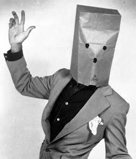
The paper bag effect is to symbolise a distinctive difference between everyone else and the protagonist

Fake letter


This letter is a trigger for the world wind of events what will occur after